If you have a csv with a list of values, and you want to see the distribution, R is an excellent choice.
First, you need to load the data:
data <- read.csv("data.csv", header=TRUE)
(faster methods are available, for large datasets)
You will also need to install ggplot2, if you haven’t already:
install.packages("ggplot2")
(you can install the entire tidyverse, but that seems to download most of the internet)
Finally, import the library, and generate the chart:
library(ggplot2)
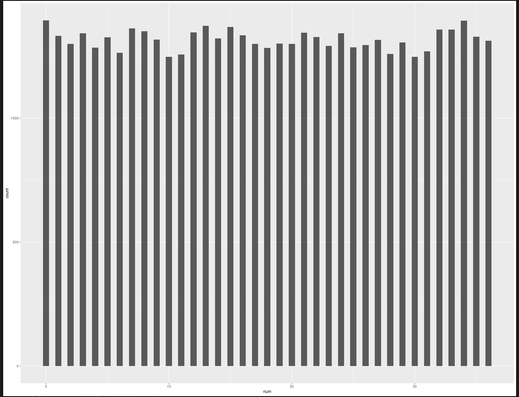
ggplot(data, aes(x=num)) + geom_histogram(binwidth=.5)
Et voila!